

What You Don’t Know About Milton Glaser’s “I ♥ NY”
3rd May 2018
If you've passed by our shop recently you may have noticed that our latest window display is all about our love for London, inspired by Brick lane and Milton's Glaser iconic I ♥ NY design.
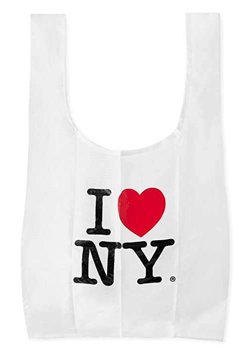
Milton Glaser’s 1977 “I ♥ NY” is perhaps the greatest love letter of all time–how could we not indulge in a little background for Design History 101’s very first Valentine’s Day? Especially since the story behind it still holds a few secrets.
First, you’ll notice it says “NY,” not “NYC.” Even though the slogan has become more closely identified with the city, it was actually made for an ad campaign to celebrate the state. And while 100% of the design credit goes to Glaser, the famously simple phrase was created by Mary Wells Lawrence and Charlie Moss, the principal and creative director (respectively) at Madison Avenue advertising firm Wells Rich Greene.

It first appeared in a television commercial in 1977 that featured a song of the same name written by Steve Karmen that was adopted as the state song in 1980. It was only then that William S. Doyle, the New York Deputy Commissioner, hired Glaser to design a logo to support the state’s advertising campaign. As the story goes, Glaser sketched the logo on the back of an envelope on the way over to the meeting with the agency, and even donated his efforts pro bono thinking the work would last all of “two weeks.”
Perhaps this goes to show that sometimes the first idea is the best one. Over the past 34 years, the logo has been adopted on every major continent and in every major city, from “I ♥ Chihuahuas” to pretty much anything else one could love, most notably as an ode to the city that never sleeps, as opposed to state as a whole. Decades later, however, Glaser received a cease-and-desist letter from then Governor Pataki’s administration in a futile attempt to reclaim the logo for the state. Milton’s Valentine to New York remains to this day.
The original logo is curiously not in the AIGA Design Archives, but his reinvention and reaffirmation following 9/11 is. In this new version, the heart represents Manhattan and the black mark, the area of the attack. It appeared on the cover of the Daily News on September 19, 2001 and on posters for the School of Visual Arts around the city.
And just in case anyone has a hard time deciphering the logo, there’s Stefan Sagmeister’s adaptation. From the Archives: “The designers of the bag didn’t trust New Yorkers to grasp the meaning of ‘I heart NY’ and have helpfully provided the word ‘love’ inside the heart. Just to make sure, they also forged the o of love into a heart shape. This bag has recently been voted ‘the most stupid design of New York’ by an informal get-together of New York designers.”
Words by
Steven Brower
For full article click here