
")
Styling Purple: The Pantone Colour of the Year (2022)
Posted by East End Prints on 14th Apr 2022
Each year Pantone chooses their colour of the year. Last year we saw a grey that mirrored how many of us were feeling and for 2022 we’re getting our spark back because it's all about the colour purple – specifically PANTONE 17-3938, Very Peri.
Purple is a colour that indicates creativity and boldness, so we’re going to look at how you can style your gorgeous space for purple now that it is officially the colour of 2022.
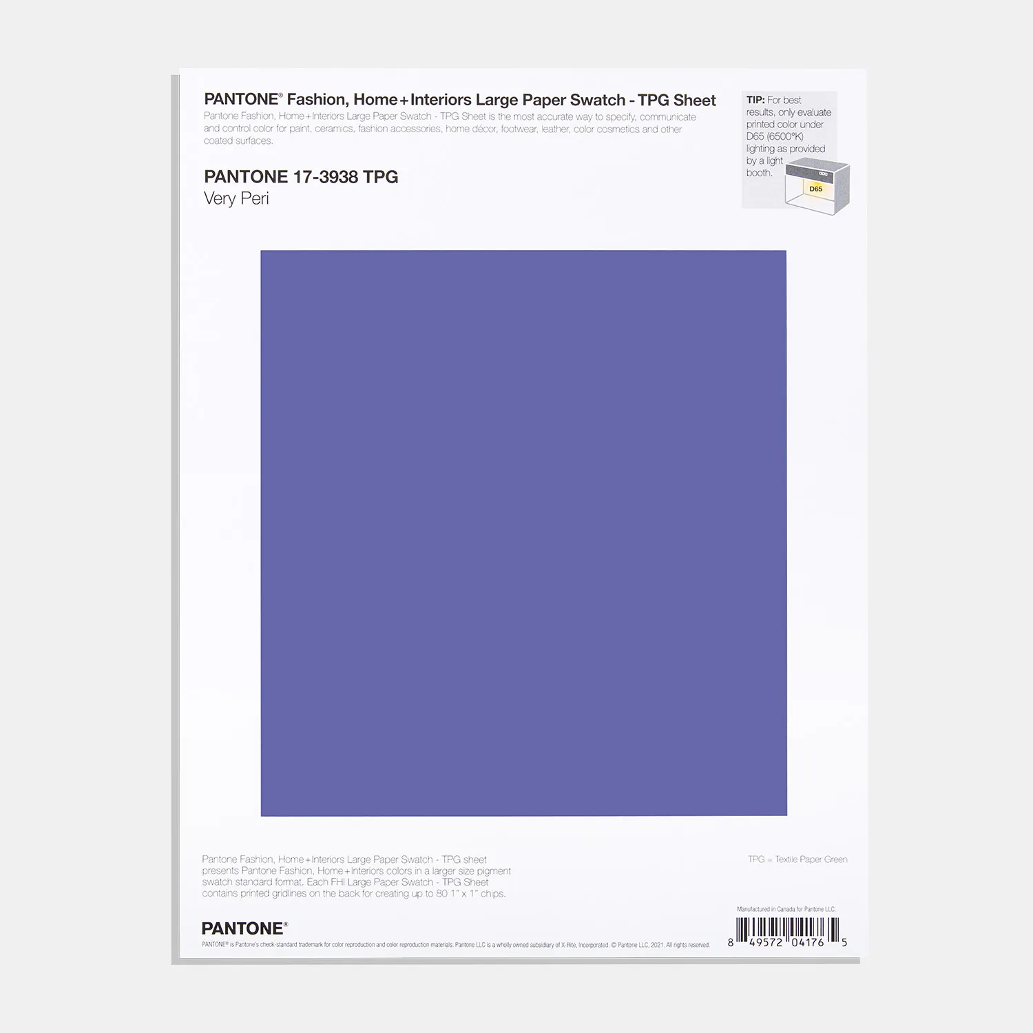
Pantone describes the colour's “courageous presence” and how it “encourages personal inventiveness and creativity.” This sounds like a vision that we can get behind. Our very first thought when we read the vision and inspiration for this colour was our fantastic selection of independent artists. Their creativity and boldness inspires us every single day, and, they too, just happen to love the colour purple.
Purple is Power

Purple has historically been about nobility and luxury. But, a more modern take on it, and Pantone’s view, shows purple to be the colour of the bold and powerful. This is the perfect inspiration for a motivational print – and a great vision for 2022!
For this reason, purple is absolutely perfect for a statement art piece in any office, living room (or even a funky art print for a modern bathroom). If you’re a badass who needs a splash of powerful purple in your life, maybe this print from Emmy Lupin is right up your street.
You’re badass by Emmy Lupin
Pale Purples & Serenity
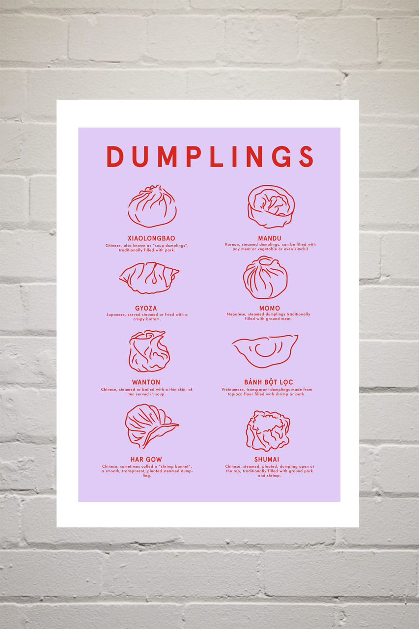
If a bold print isn’t right for you, violets and pastel purples can instead create a soothing space. If you’re looking for a purple art print to help you relax, this Dumpling Menu print is a brilliant option - and it looks great on the wall in a kitchen or dining room!
We recommend framing your prints, particularly art prints for the kitchen.
Frames will help to prevent damage and discolouration from cooking and splashes, and we’re sure you’ll agree that this stunning purple print deserves pride of place on a wall or shelf where it can be appreciated.
Dumpling Menu by Violet Studio
Purple in Practice

Whether you’re going bold or soft, there are a few ways to integrate purple prints into your decor.
Colour pops are a popular option. This means keeping a room mostly neutral and adding art prints, plant pots and pillows with purple accents. This will help to tie a room together and give it a new, vibrant feeling (without needing to find out the paintbrushes.)
Purple is a great colour to introduce into a space as it is flexible and goes well with most other colours. It is commonly matched with other cool palette colours like blues, and greys, but its red tones also make it a perfect pairing for pinks and even yellows if you’re looking for a more bold and contrasting approach to decor.
Coffee Break by Aurelia Durand
Our top tip for matching colours: Once you’ve chosen your new favourite art print from the East End Prints collection, try using the colours in your print as a palette for the rest of your space.
It’s no real surprise that purple has been chosen as the colour of the year. We’re leaving a period of grey and dullness and maybe this vibrant, powerful colour might just inspire us all to step into 2022 with a new lease of life and the confidence to make it our best year yet.